Inner Harmony: 07F-10
Past and Future
My co-worker Don has an old inkjet print of a scanned photo of the sculpture that started the Small Sculpture Revolution at the beginning of 1996. In some ways I haven't done anything better since then. The sculpture is simple, elegant and beautiful. I've gone in the direction of increased complexity since then and the results have been mixed.
It seems all art moves toward complexity, carried by improved skills and tools. It's a difficult transition and many artists never make it out of the thicket.
The only way out is through. Keep banging away at it and eventually something changes. The future visited me near the beginning of 2000, when "microsculpture" elements showed up. I'd carve a good-sized panel and then cut tiny holes in it. It looked nice but was essentially a panel with holes. Microsculpture turned into midi-sculpture and moved around, finally going inside as a sort of screen between supports.
I wanted to break away from the flat panel but modelling that in my mind was hard. Holding it in mind while under real-world conditions of time and wind was something else again. Modelling takes time. Imagination takes time. The sun slows for no sculptor, so the sculptor has to speed up. Speed with accuracy is hard to achieve but necessity pushes constantly. I learned to use my tools in ways the designer never imagined.
And, finally, the last element came into place. Call it the "Even Smaller Sculpture Revolution." Freed from having to engineer support for another foot of sand, and also from the time taken to pack that additional foot, I could spend more time learning about the insides of sculptures.
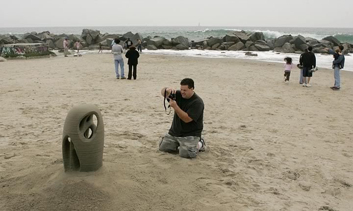
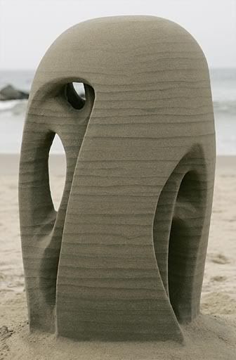
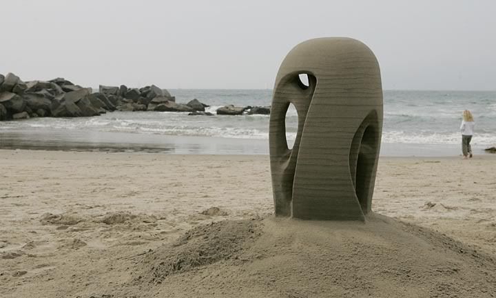
Build number: 07F-10 (lifetime start #320)
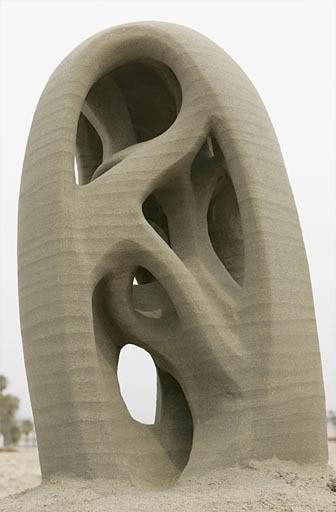
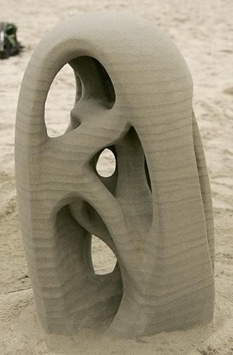
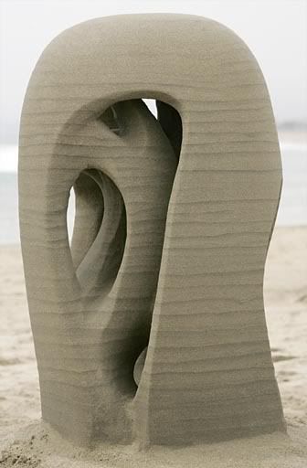
Title: "Calligraphy Doesn't Count"
Date: April 7
Location: Venice Breakwater, on the flat
Start: approx 0830; construction time about 6 hours
Height: about 2.5 feet, on tall sokkel built pretty much by mistake
Assistant: none
Photo digital: EOS-1D w/24-70 zoom, walkaround, low-angle and details, 36 images
Photo 35mm: none
Photo 6X7: none
Photo volunteer: Rich, digital
Video: none
Visitors: Rich, SuZi
Equipment note: overhauled sprayer worked much better. High maintenance item.
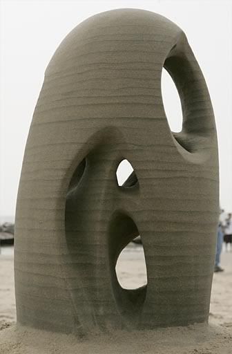
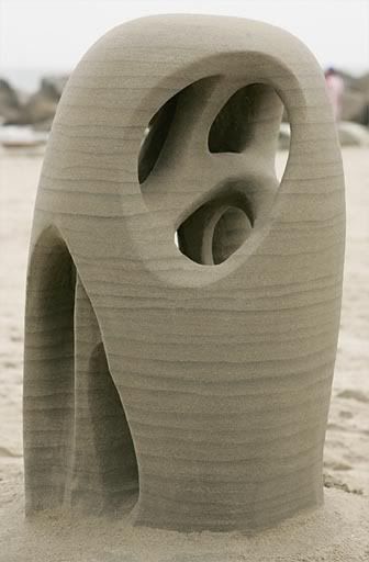
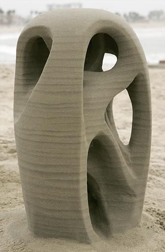
Perhaps because I started by making arches, I'm one of the very few sand sculptors who thinks about the inside of a pile of sand. An arch has an inside and an outside, and once I'd made a few I started experimenting with the inside. Using forms allowed me to work even more on the inside, usually as a way to support the outside.
I wanted depth. With detail. This brings about access problems. Like any other miner I have to find a way to get in there and a way to get the waste sand out. Early experiments with this produced half-dime like sculptures, the one side cut off to allow entry. The rest of the dome was carved into increasingly complex braids. It looked good but I wanted more. I wanted to make the inside braided too.
What of beauty? Does complexity lead to beauty? Not often. Mostly it seems to impede the perception of beauty: can't see the forest because there are too many trees. The designer's problem is to make a day's worth of carving look like one piece while retaining the complexity. Complexity within simplicity.
So, this sculpture was intended as a design exercise. My carving skills have gotten to the point where I can, with some forethought, get into most places inside a sculpture. The key is to balance the size of the windows with the size of the outer surface. Windows too big make the surface into support legs. Windows too small make carving difficult and also keep me from seeing what's in there. Invisible beauty may be there but I'd like to see it.
This sculpture is unusual in that I worked on the outside while planning for the windows. Subtle shaping of the surface made a place for the windows. Mostly. I screwed up one spot and made it too thin, but reshaping solved the problem. This is why it's good to sneak up on things. Sketch first, then, if it works, bring out the heavy tools.
"Well, it definitely takes the Johnson prize."
"That's good, Rich." The angry duck of 1998 is long gone, fortunately. No snakes biting knees, either.
"I do see a K over here. Or is it an R? Maybe that's the title. 07R0 something. The 0 is on the far side. Here's the R, and the 7 is this big part."
"Oh, yes. Does that mean...?"
"No. Calligraphy doesn't count." We both laugh. How many other artists have to put up with hecklers in real time? Well, Rich pays for the privilege with nice fresh chocolate chip cookies.
The whole thing works well. I like looking at it.
"To me it's the year's best."
"Close to it." For adventurousness I like one of the January sculptures better, but this one has a contained organicness that I like a lot. It has been a long time coming.
2007 April 8
# © 1765 by Larry @ 
![]()